Timeline

Sept-Dec 2025

Sept-Dec 2025

Role

UX designer (research, testing and design)

UX designer (research, testing and design)

Team

6 HCI

students

6 HCI

students

UBC Workday allows students to create schedules and complete course registration successfully. However, our research with 11 students revealed three recurring pain points with the current UBC Workday interface. My team and I redesigned the experience around these findings.

Making Course Registration Effortless for Students

UBC Workday Redesign

designed and built with:

the problem

In think aloud observation sessions and interviews with 11 students, these were the recurring frustrations.

Inefficient Workflows, Confusing Calendars, Uninformed Decisions

Inefficient Workflows, Confusing Calendars, Uninformed Decisions

Nearly all students stated they relied on external resources, alongside recurring complaints about a lack of clear calendar views and an inefficient workflow.

the goal

An intuitive and informative platform that helps students plan across terms and make decisions without relying on external tools

An intuitive and informative platform that helps students plan across terms and make decisions without relying on external tools

user research

Grounding Design in Real Student Feedback

We conducted multiple rounds of user research to gather direct feedback from students on the current Workday interface and our designs. We also conducted internal cognitive walkthroughs to catch prototype problems as our fidelity increased. As students ourselves, we understood these pain points well which helped us stay focused on the user throughout the project.

User research

User research

Identify current pain points

Identify current pain points

Ideate

Ideate

Brainstorm ideas to solve problems

Brainstorm ideas to solve problems

Feedback

Feedback

Validate solution and identify problems

Validate solution and identify problems

Feedback

Feedback

Gather user feedback to find best idea

Gather user feedback to find best idea

Iterate

Iterate

Fixing problems and adding visual design

Fixing problems and adding visual design

Creating a low-fidelity prototype

Design

Reflection

Reflection

Identify prototype problems internally

Identify prototype problems internally

This helped us discover that what students wanted most was not fewer clicks but rather a clear calendar view for both schedule creation and viewing.

Clear Calendar

Clear Calendar

As students search courses, they can add them to the schedule to see how they compare to their current choices.

Course List

Course List

The current interface displays courses as a list without calendar visualization

before

after

Calendar Visualization

Calendar Visualization

Our user research showed 8/11 students valued clear calendar visualizations which helped us discover that students don’t just want fewer clicks. The current UBC Workday interface only has a list of courses without calendar visualization which user research revealed as a feature students wish they had. As such, we decided to embed a calendar in the schedule creation process.

design decision 1

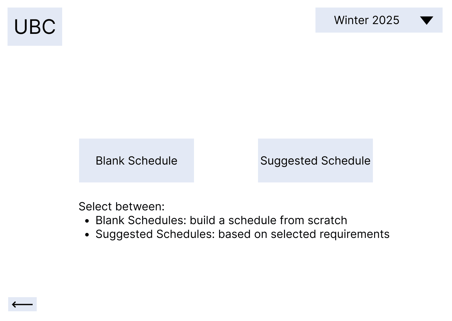
Unclear options

Users felt two choices were daunting and the descriptions did not provide enough context for each choice

Clear descriptors

The longer button descriptions tell users exactly what path they are heading down.

before

after

Based on cognitive walkthroughs by our own team, we identified an early issue in our starting page. The original starting page offered two paths without enough context causing users to feel unsure which option to choose, and worried they couldn’t go back once they’d committed.

In the next iteration, we added clearer button labels to help users confidently make an informed choice.

Confusing Starting Page

design decision 2

before

after

Unclear Search Bar

The colors and typography of the search bar and filters look similar, making them hard to distinguish.

Filters Trade-off

We decided to prioritize a simple course searching experience rather than introducing more clicks and complexity with filters

Unclear Search and Filtering

Our cognitive walkthroughs also revealed that the filter and search section of our low-fidelity prototype slowed users down. The search bar was too visually similar to the filters, making it hard for users to easily locate.

We considered redesigning the filters to be visually distinct but we decided removing them was the simpler fix. The search alone covered the majority of what students were trying to do, which was adding courses, and the filters added a layer of complexity without a clear payoff.

design decision 3

Problem 1: Students relied on outside tools for course information

Our solution:

Our solution:

Our solution:

Problem 2: Creating a schedule was confusing without a calendar

Problem 3: Students found building a schedule without a calendar inefficient

rating for

clarity

4.5/5

10/11

participants described the workflow of creating a schedule as clear and logical.

rating for

efficiency

4.2/5

9/11

of participants found having a calendar view increased their efficiency when creating schedules

rating for

integration

4.1/5

8/11

participants noted the information pop ups are useful.

usability testing results

Validating the Design Through Usability Testing

With a second group of 11 students separate from our initial research participants, we evaluated whether our design improved the UBC Workday interface. These results map directly to the three problems we set out to solve which were inefficient workflows, unclear calendars, and not enough course information.

We noted when participants mentioned improvements in the core three problems and asked for subjective satisfaction ratings during the interview.

Final Design

The final design resolves all three problems identified in research as students no longer rely on outside tools for course info, schedule creation is clear and logical, and the calendar view increases efficiency.

reflections and conclusions

what I learned

next steps

As my first design project, this taught me not to get too attached to any single iteration. I was initially attached to the two-option starting page and filtering system believing that it would help students with course registration. However, after team discussion, I learned that they added friction rather than confidence for students in schedule creation. Always keeping users in mind is something I will take with me for my future projects.

During usability tests, the most requested change was to integrate more information in the pop ups such as course averages. We would also add options to select a term and a name for the saved schedules, and delete courses during schedule creation as these are crucial steps in creating a schedule since students often create multiple schedules and make edits.

resume

2026 kathy zhang

Create a free website with Framer, the website builder loved by startups, designers and agencies.